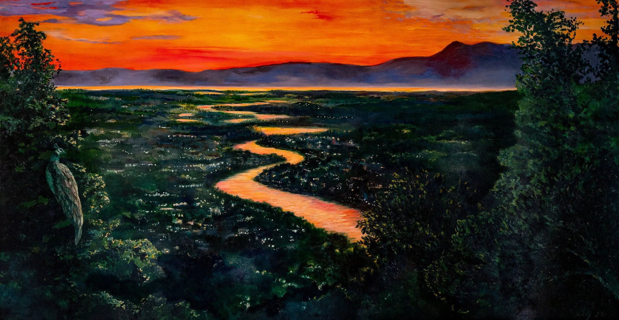
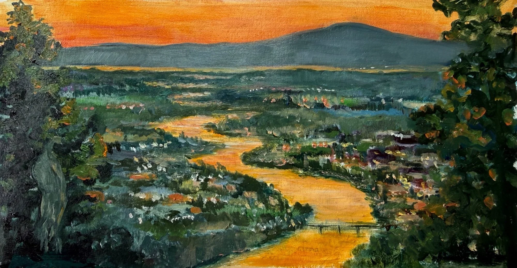
River of Light, oil on panel, 42” x 80”
The Brief
My clients were redoing their dining room and asked me to make a painting for a large recessed niche in one wall, 44 x 84 inches and 4 inches deep. The niche had been there when they moved in years before, and nothing they tried had ever felt right in it. They didn't have an image in mind. What they did know was that they wanted a dark palette to work with the rest of the new room design.
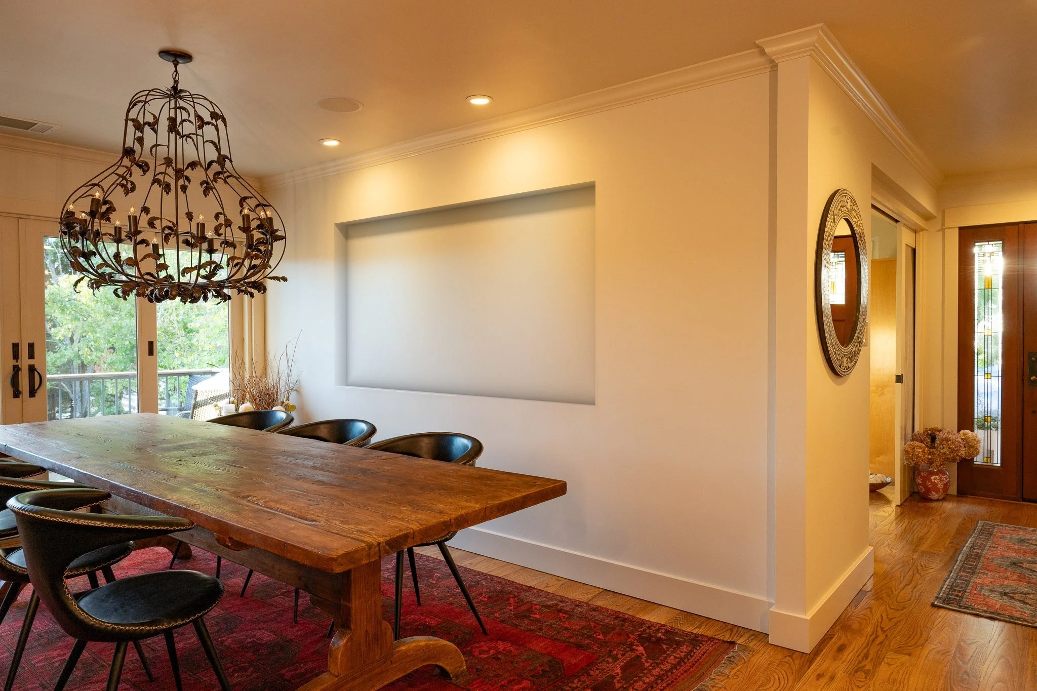
dining room, obligatory “before” shot (digital mockup)
The Room
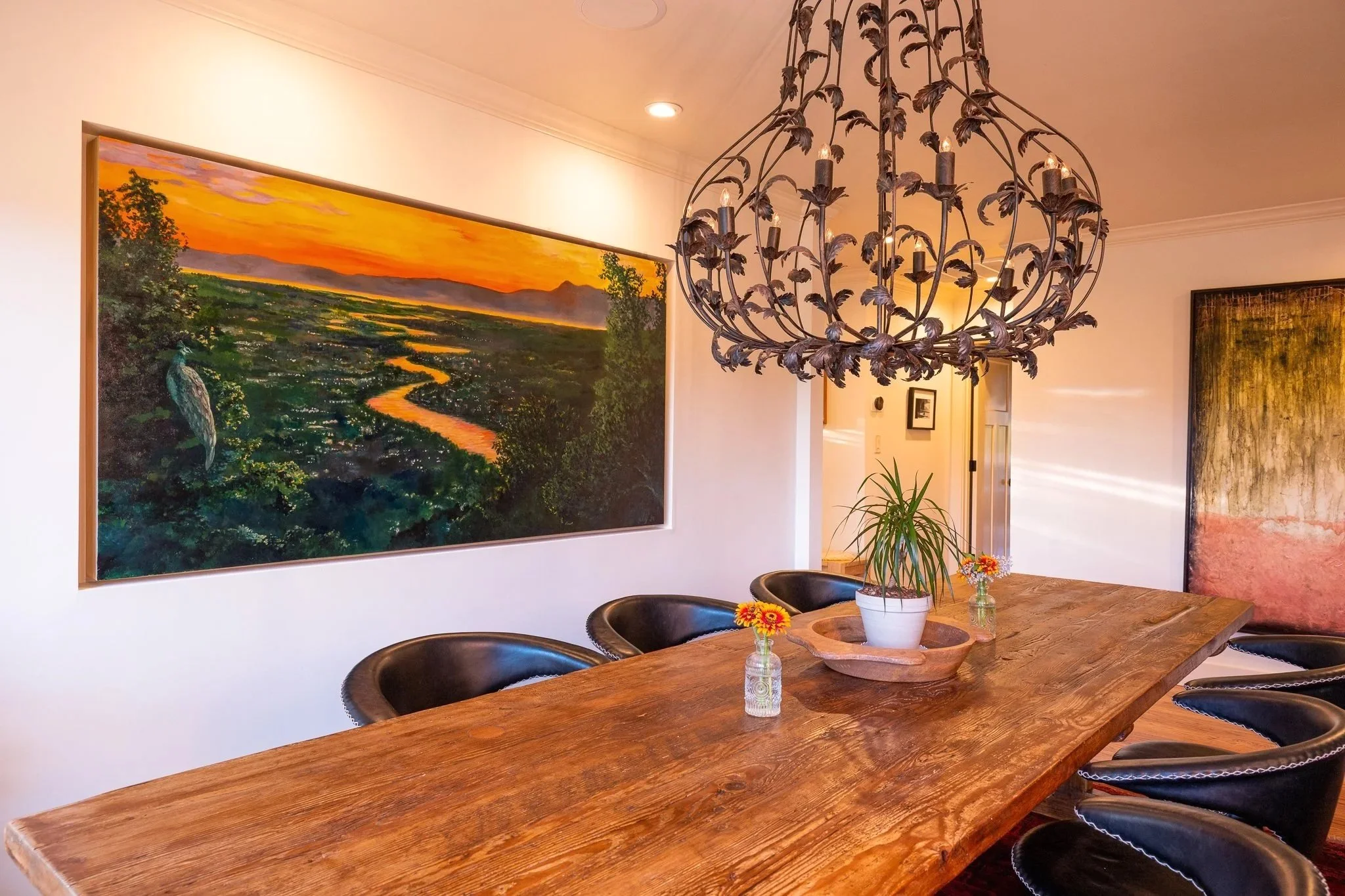
To my eye, the long horizontal format was asking for a landscape. The room is narrow, with strong light coming in from one side, so the painting needed to open the space up without crowding it. Across from the niche were a large mirror and a built-in cabinet freshly painted deep slate, a dark wood table for eight, and a chandelier with plenty of personality of its own. Whatever went in that niche had to hold its own with all of it.
The View
We talked about which landscapes meant the most to them, and they chose the view from the family home on Atlas Peak, where the husband grew up and his mother still lives. From the back deck you can see a lot of the east side of the city of Napa, the river winding south toward San Pablo Bay, and the hills rolling toward the bay, with Mt. Tamalpais on the horizon - a peak they singled out in our very first conversation. They described a spectacular scene on certain evenings when the setting sun catches the water and the river glows orange: a river of light.
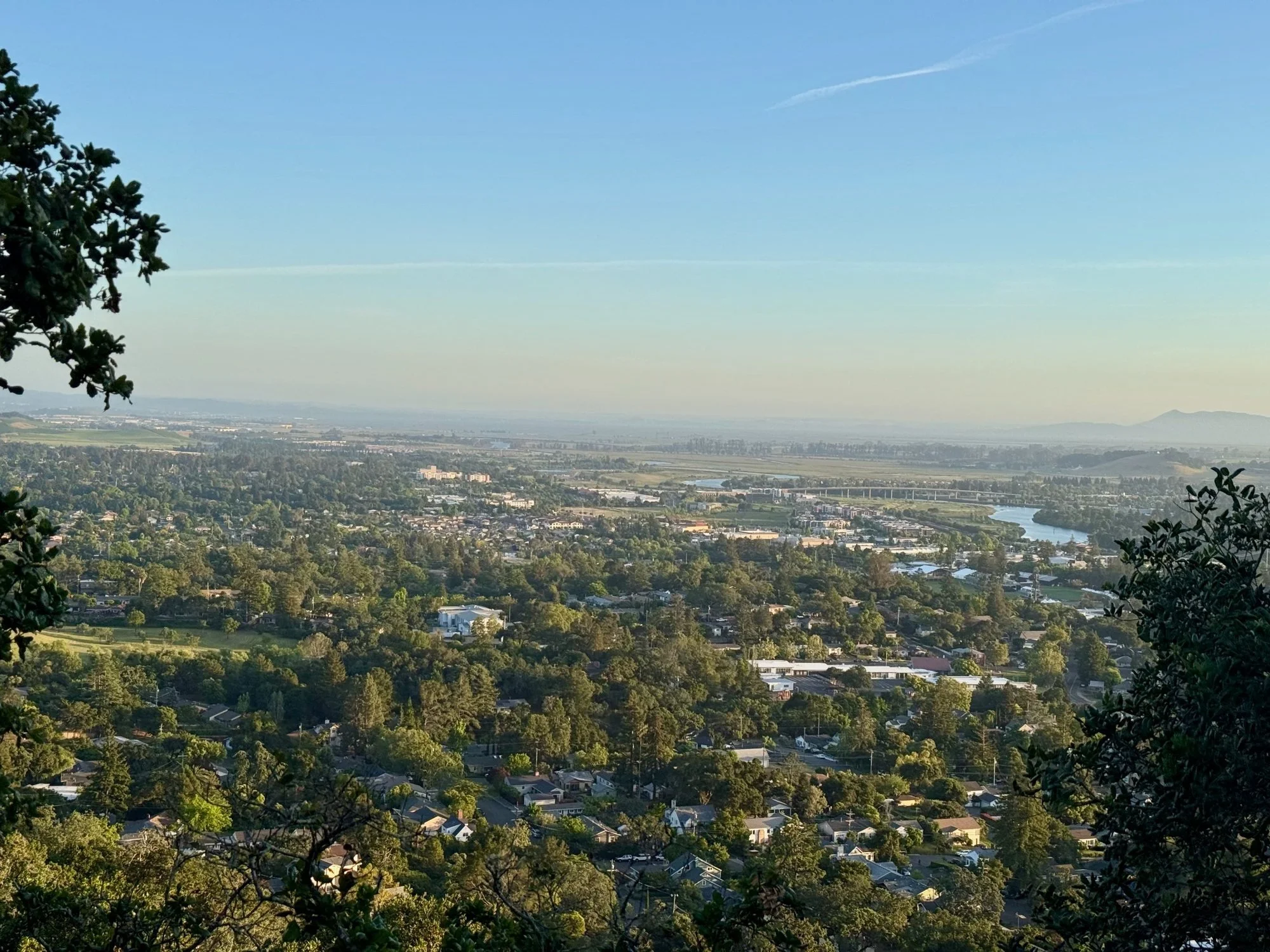
evening reference shot from my site visit
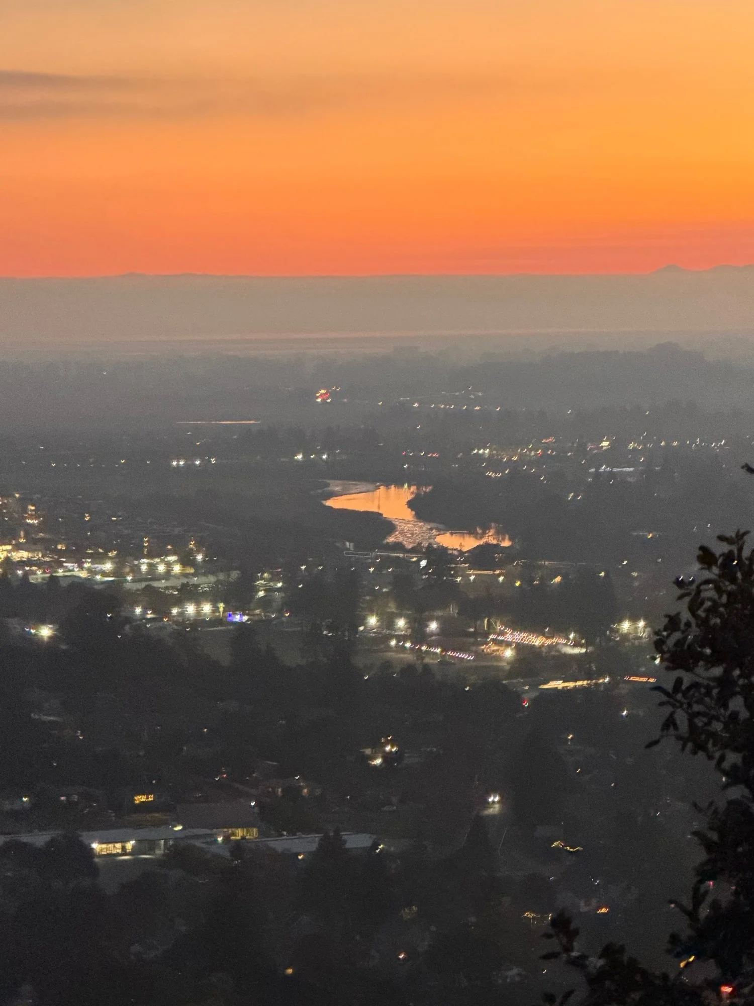
sunset view reference image provided by the clients
Myrtle
I wanted one more focal point, and when I heard about Myrtle, I knew she needed a cameo. Myrtle was a wild peahen who lived in the oaks behind the family home and liked to perch in the branches to survey her lands. I painted her from some online photographs I found of peahens in trees (via iNaturalist.com, a great site for any nature lover). Her story isn't over, either: a new peahen recently turned up in the backyard. Possibly Myrtle's granddaughter. I like to think so.
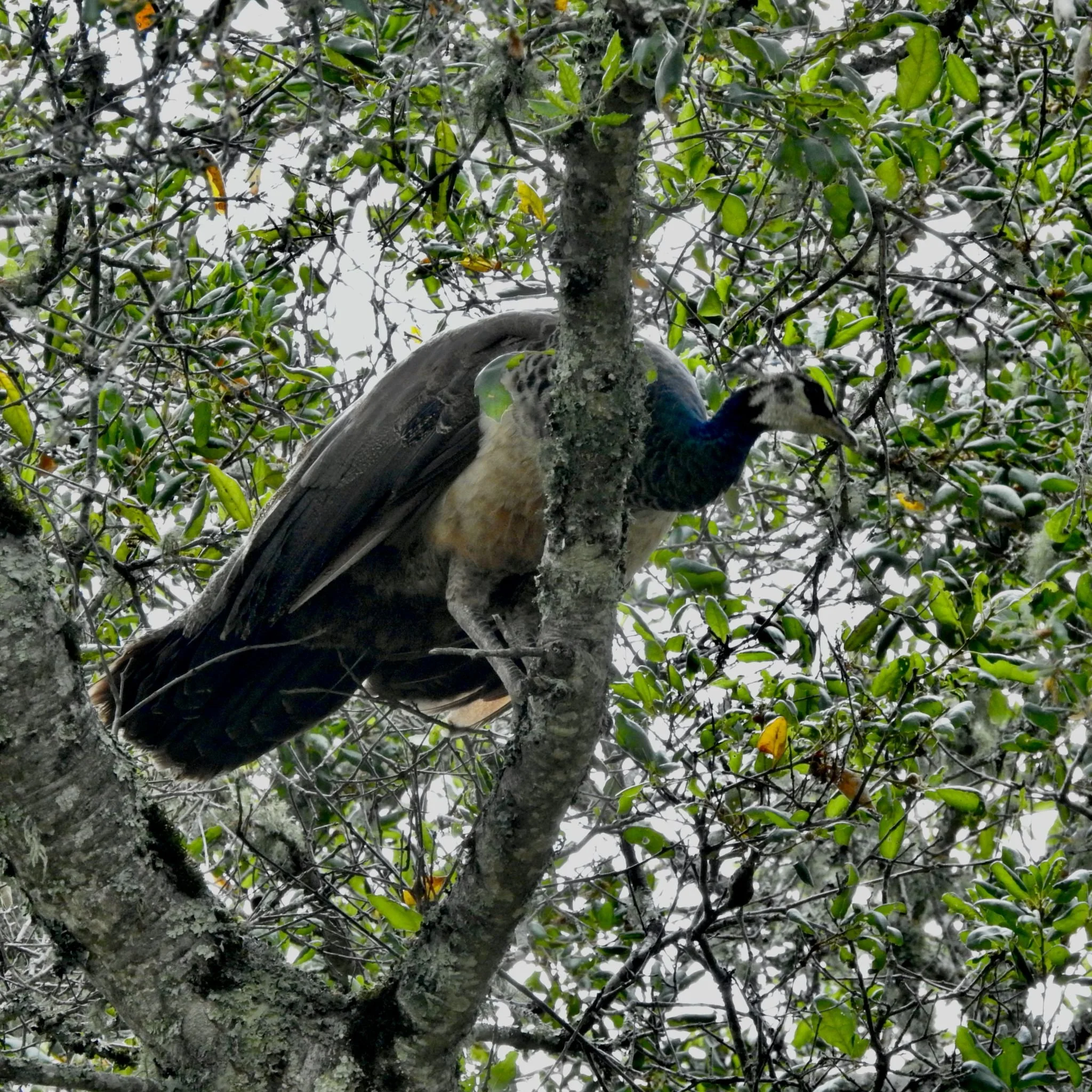
Wild peahen in Sonoma, California. Photo © Daniel Levitis, CC BY, via iNaturalist
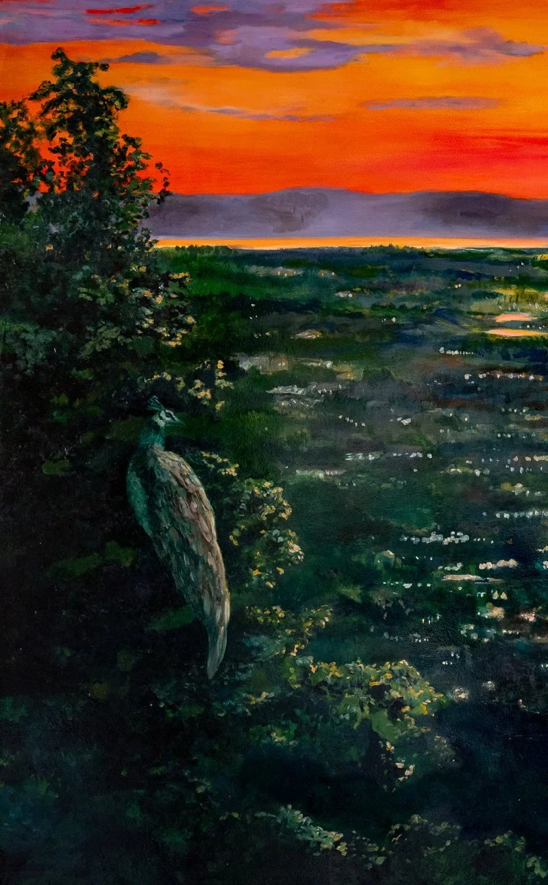
detail crop of my painted Myrtle
Finding the Composition
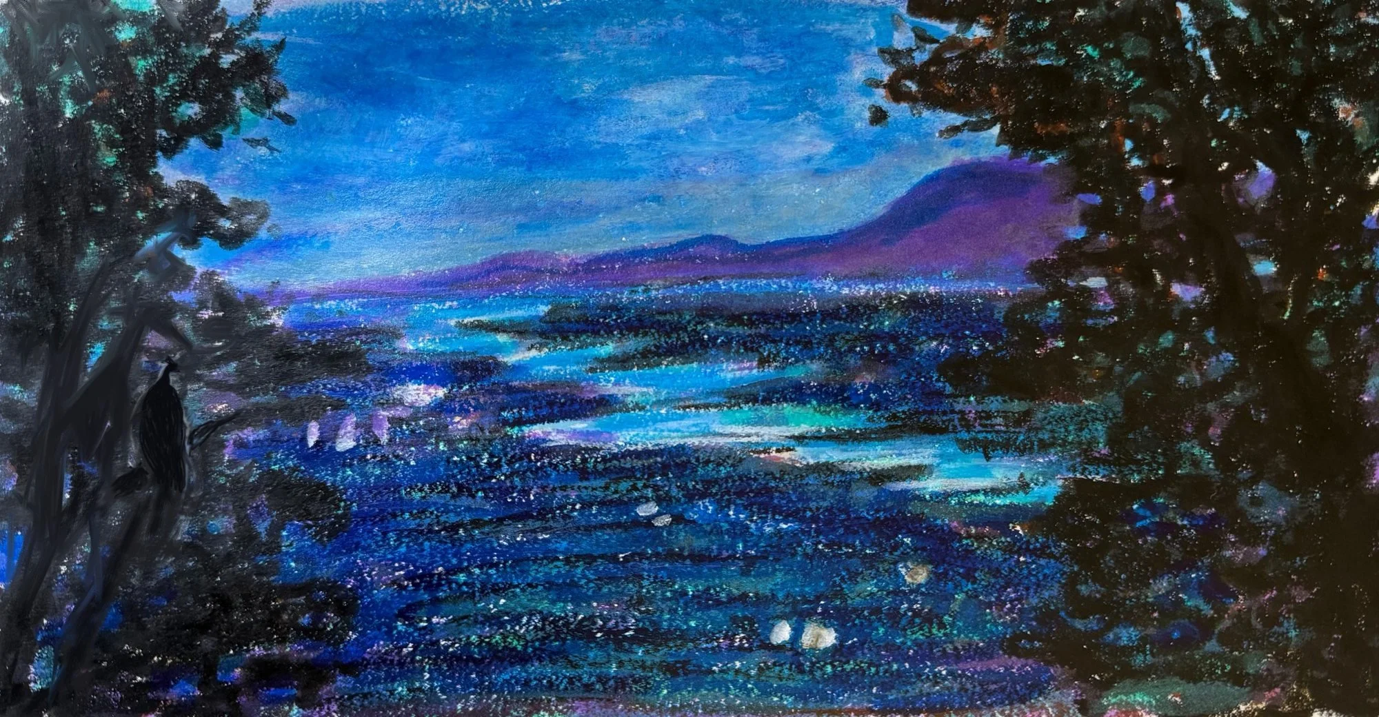
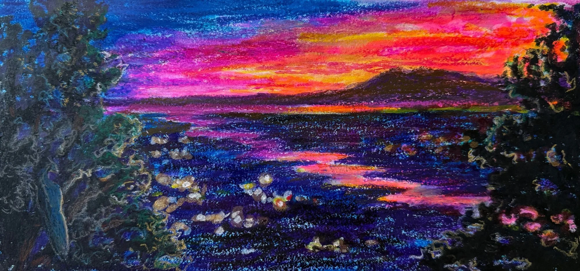
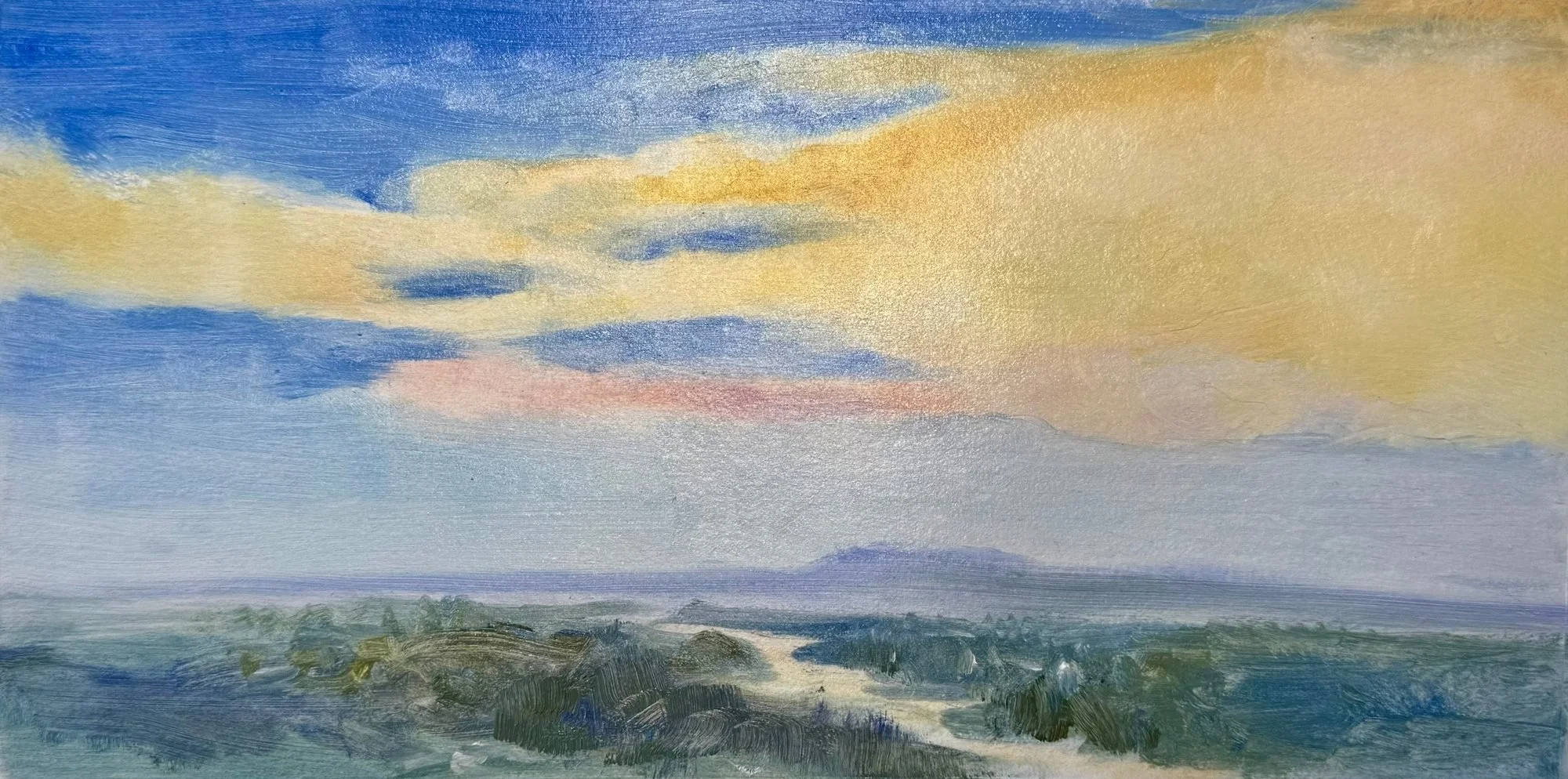
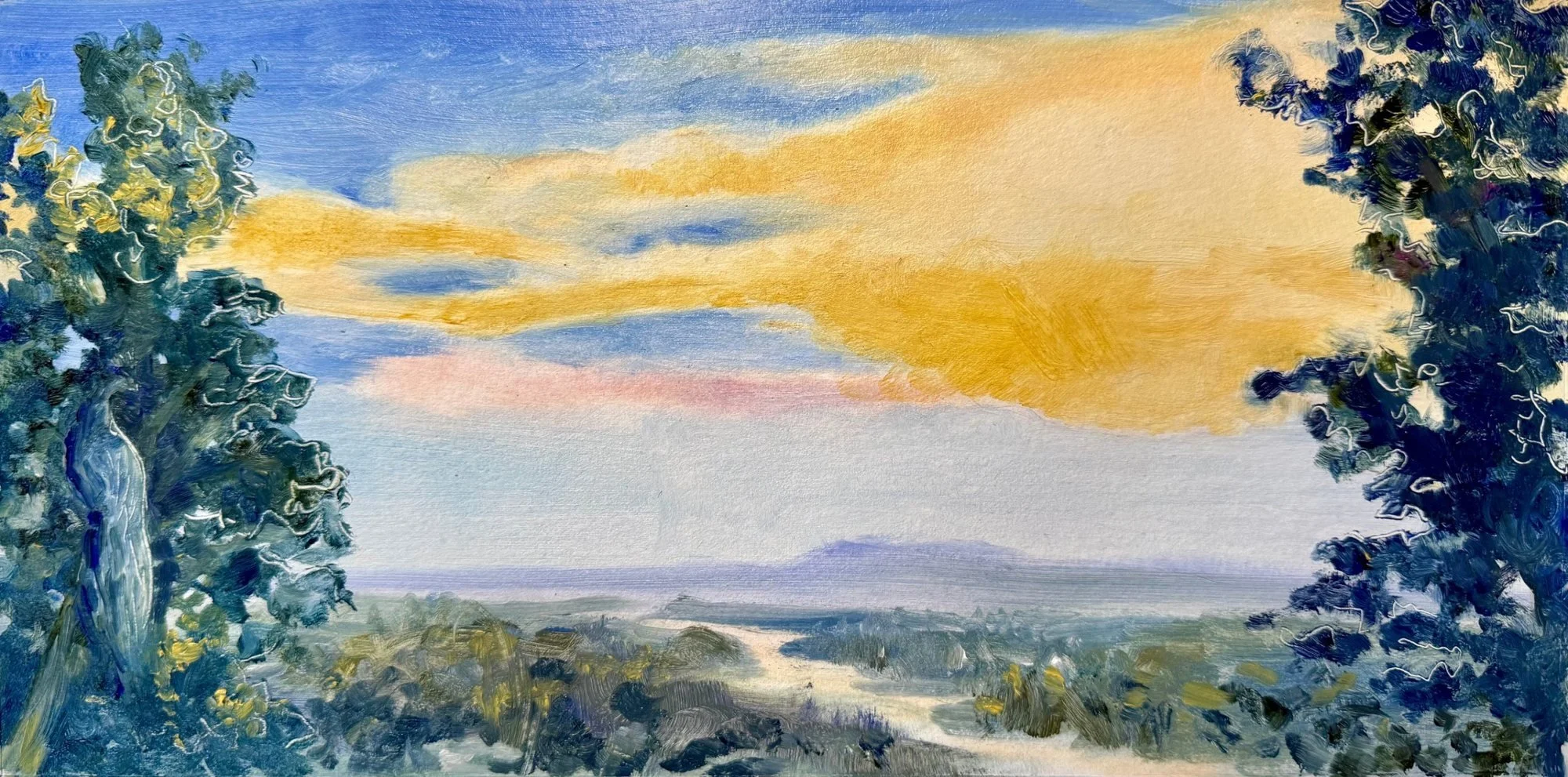
Now that I had all the main components in place, it was time to sketch and work out composition and palette. My early sketches were loose and moody with the focus on the shape of the winding river. As the images developed with the clients’ input, the design became lighter and open with softer blues and lighter yellows.
From there we narrowed in on what each of them loved most. For one, it was the brilliant sunset and the river carrying the light. For the other, it was luminosity and calm water, with the town present but soft. So I raised the horizon to let the river and valley hold most of the frame, with the sky as a crown of light above. I traced the river's true bend as seen from the deck rather than a generic curve, because that bend is the view's signature.
Before moving to the panel, I asked them to sit with the final sketch. Once I had their sign-off, I moved into the painting itself. The sketch sets the feeling and the bones; the painting is where the depth and refinement happen.
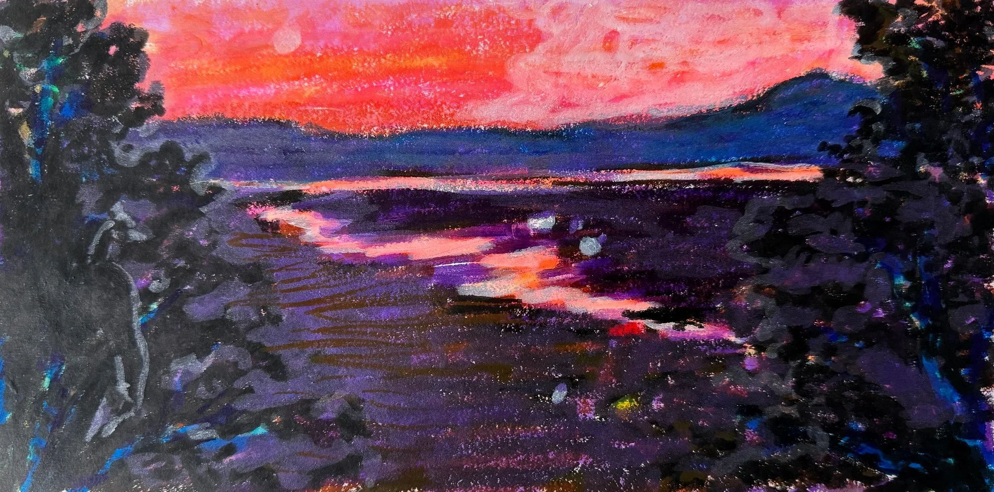
In the Studio
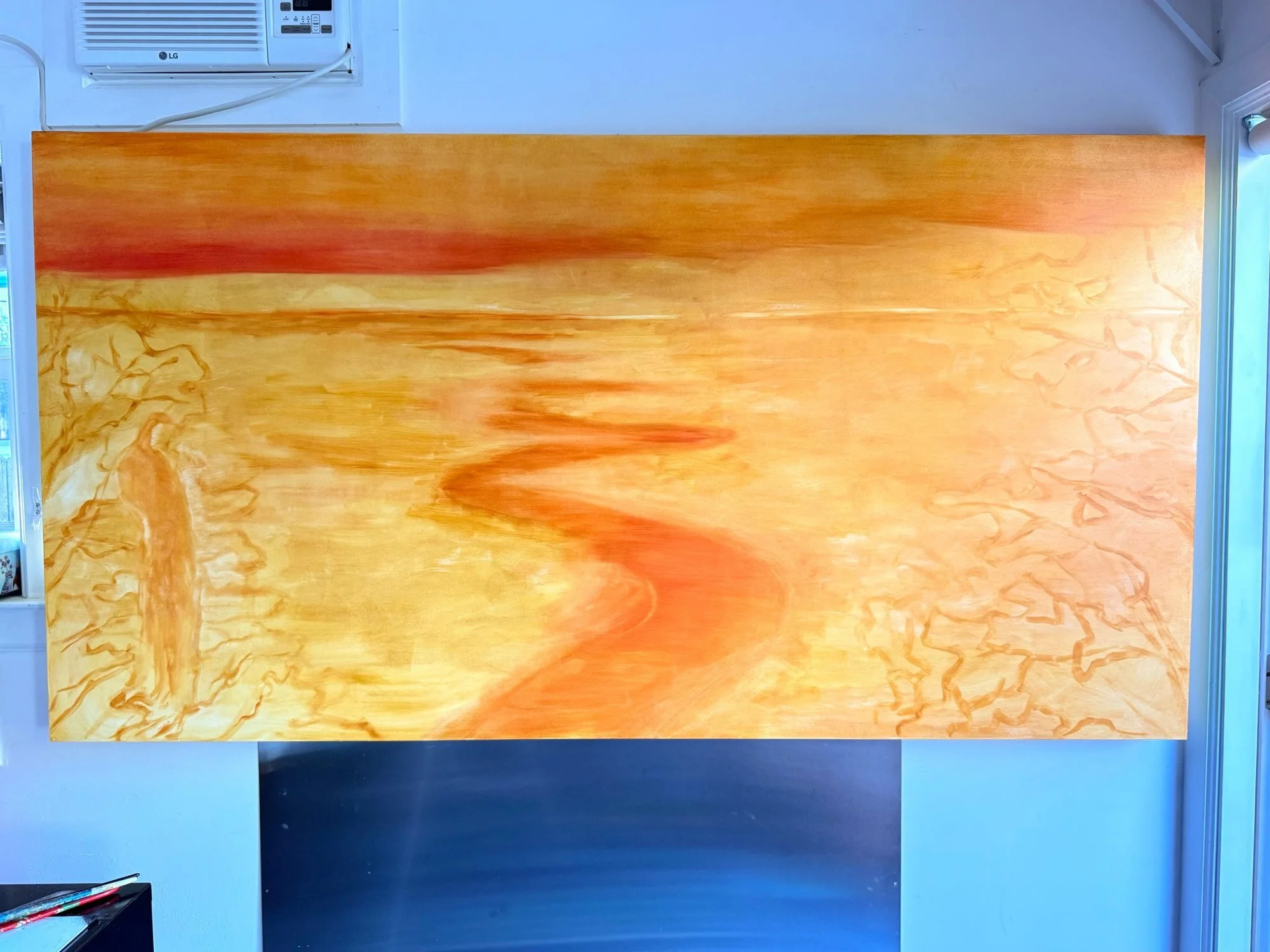
the panel in my studio, showing my first layers of ochre and orange underpainting
Kirk Gillespie of Color Theory Art Surfaces built a custom 42” x 80” panel (sized a bit smaller than their wall niche). It turned out to be exactly the size of my painting wall, with about an inch to spare on each side (!). A tight fit, but it meant I lived with the painting for the two months I worked on it, which is a great way to see what’s working and what isn’t.
Like all paintings, it kept evolving as I worked on it at full size. In the sketches I had filled the near bank with buildings and a bridge, much of it invented to suggest the town of Napa. (There are 2 main bridges over the river downtown but they are not actually visible from the deck.) But at 80 inches wide, those added details just never sat right. The river felt like it fell off the front edge of the painting. I had to let it go and trust the actual view with a few updated details - like the scale of Mt. Tam and the ridge line (enlarged) and the placement of the river in the distance (moved left) to emphasize the parts of the view they loved most. The painting started to come together.
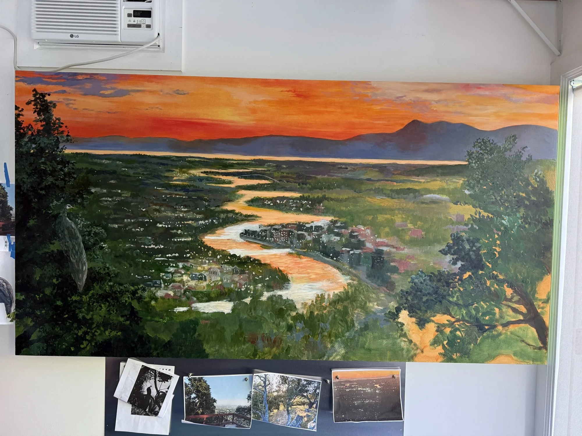
painting in progress after moving the river at the bottom of the panel
Large oil paintings take time, and this one had opinions about its finish. Where I’d used more medium to knock back the city lights, the surface came up glossier than the rest, so I oiled out the duller areas to even it up. But the first varnish coat still left the sheen uneven, shiny in places and flat in others. Another coat of matte varnish and then a layer of cold wax medium (c/o my lovely friend and fellow painter, Nancy Willis) eventually settled it into an even, soft surface that holds up to the strong side light in the room.
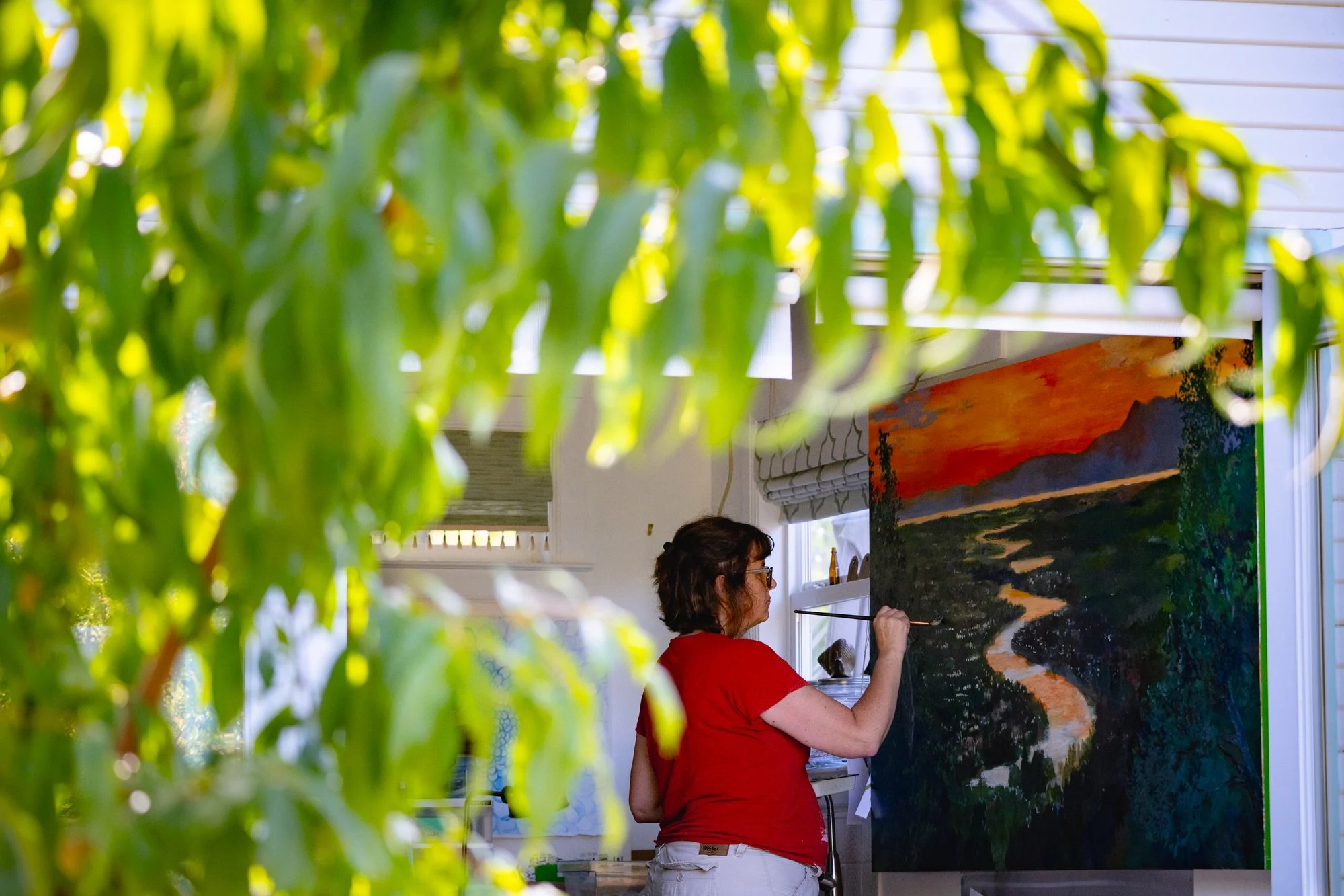
In my happy place; Izzi caught this snap of me working in my backyard studio, doors flung wide open
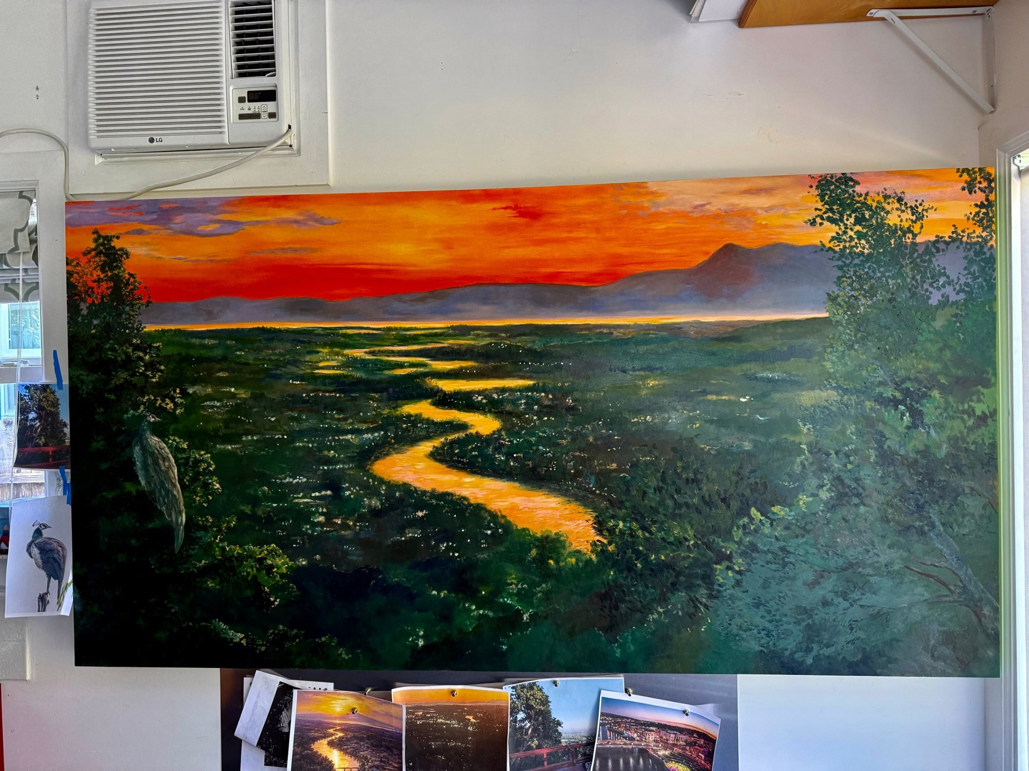
almost done!
The Result
Kirk installed the painting, and I'll admit I held my breath until the panel slid into the niche with room to spare. Now the room feels complete. There's no longer a big empty space calling out for something. The painting's depth of color and large scale balance the slate built-ins across the room, and the dining room feels warm and inviting.
Images: Izzi Valencia / Infinity Visuals
Do you have a place like this?
If there's a view, a garden, or a stretch of water that means something to you, I'd love to hear about it. Every commission starts with a conversation.